Agency & Client
Delivery
Keco
Role
Creative Direction
Art Direction
Photography Art Direction
Videography Art Direction
Photography
Design
Retouching
Scope
Brand Strategy
Brand Identity
Brand Name & Tagline
Brochure Design
Print Collateral
Display Suite Design
Signage Design
Environmental Graphics
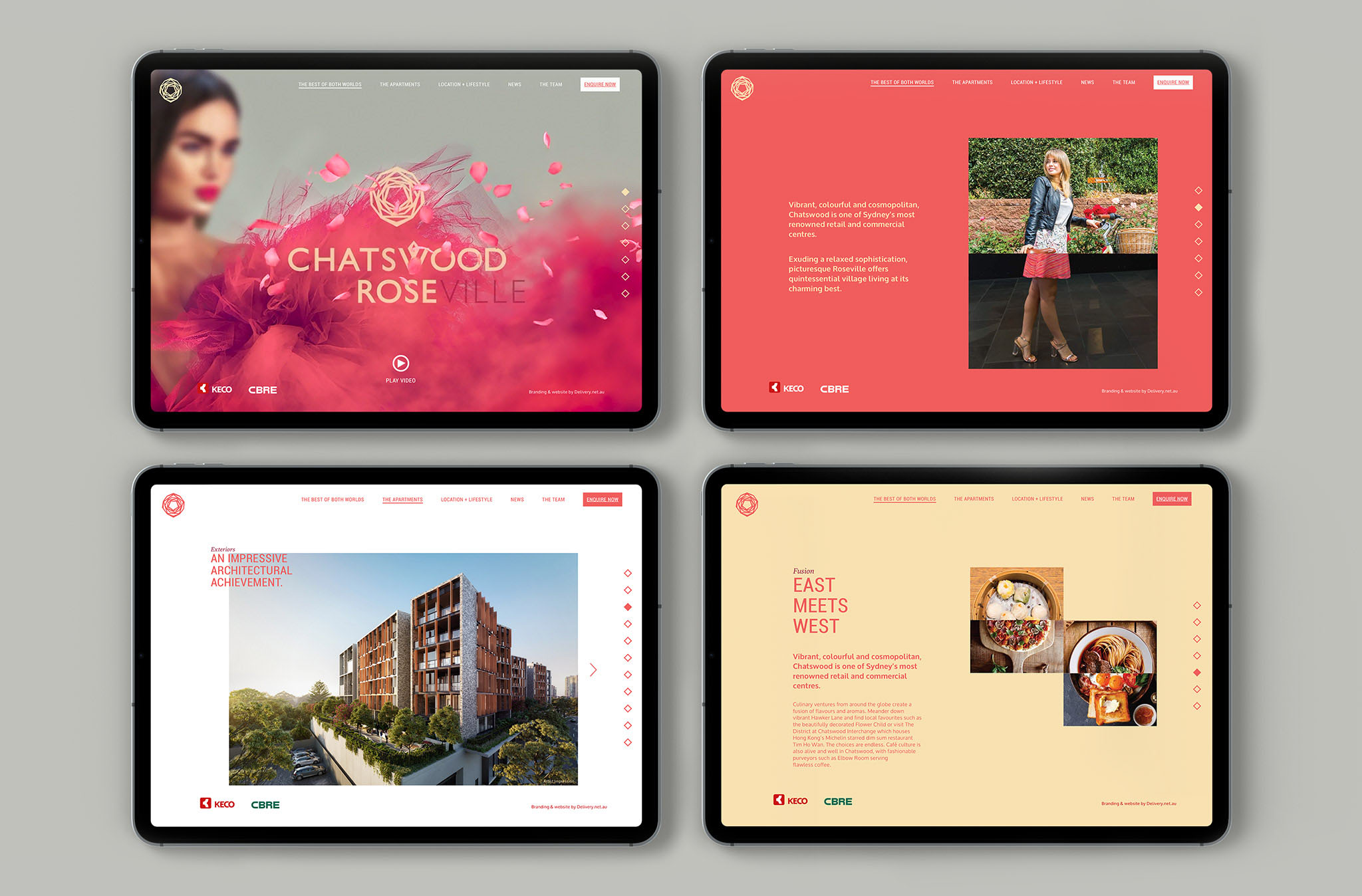
Website Design
Connecting
the best of
both worlds.
This residential development is located on the fringe of the pulsating Chatswood yet in the tranquil, leafy village suburb of Roseville. The challenge here was to create a brand direction that would appeal to both, whilst my strategy was to create a brand that would appeal more to the glitzy, trend focussed Chatswood crowd.
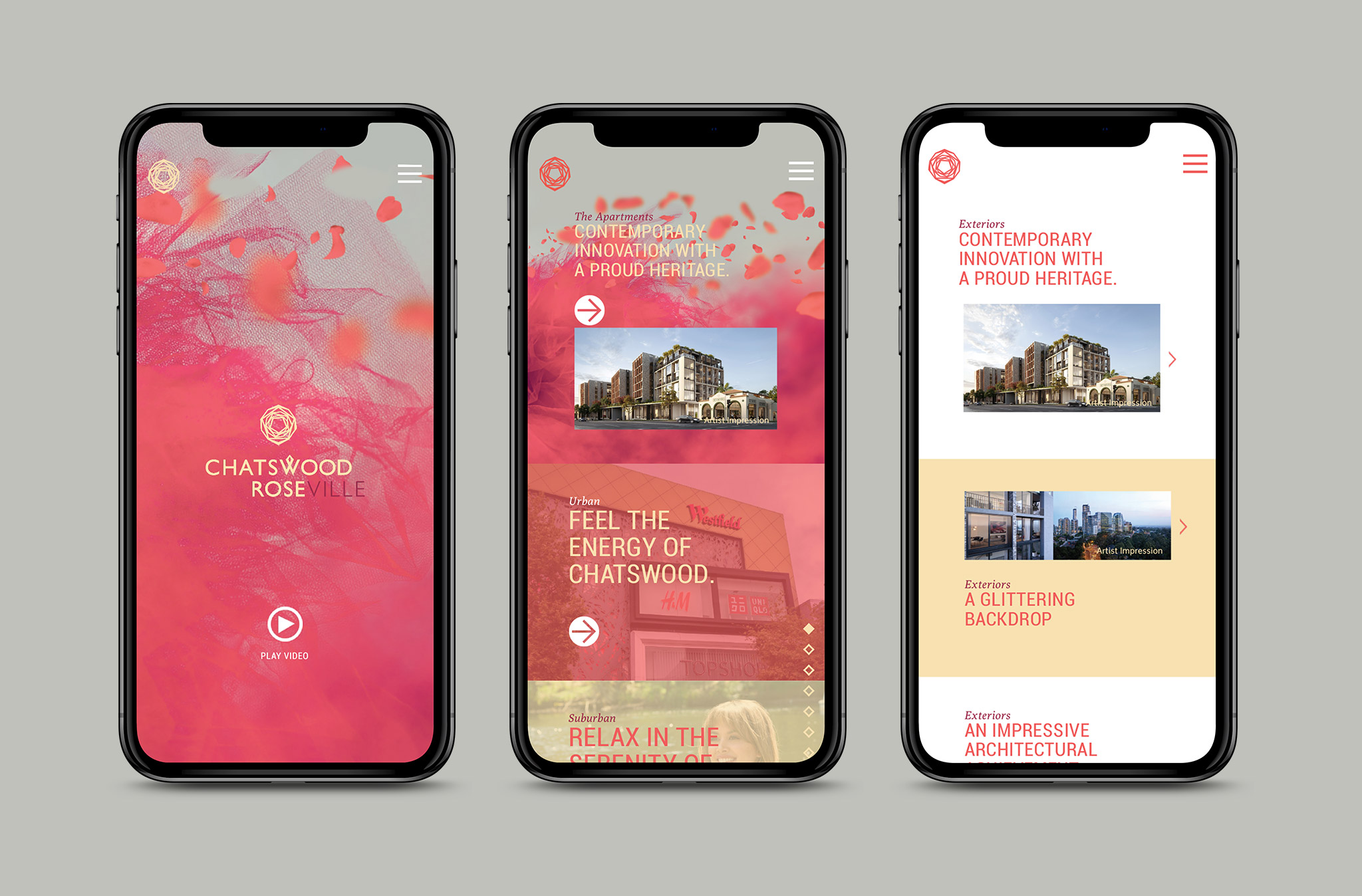
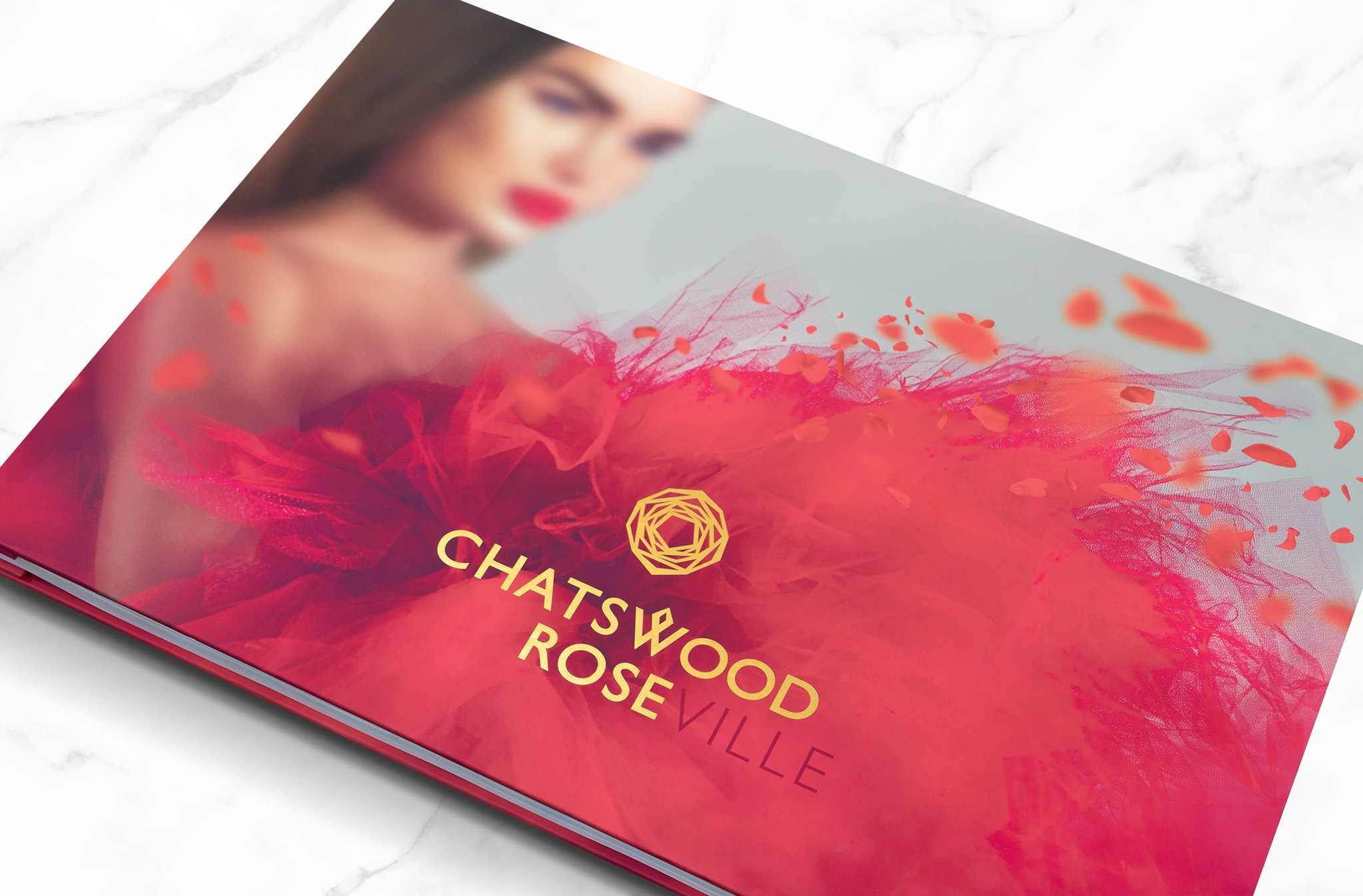
My concept for the name Chatswood Rose was to showcase both Chatswood and Roseville in the name, however cleverly treated in a way that Chatswood Rose is predominantly the name seen and ultimately known for.
This was coupled with a beautiful, elegant, sophisticated visual of a woman in high fashion and floating rose petals. Complimented by a modern emblem and typography, creating a luxurious high-end desirable brand.
Printed on premium Silk HD paper stock with gold foil embellishments throughout the hero brochure and sales book, the campaign narrative told a story about life in both neighbourhoods and ‘Connecting the best of both worlds’. Highlighting the urban features of Chatswood, and the suburban village lifestyle of Roseville.
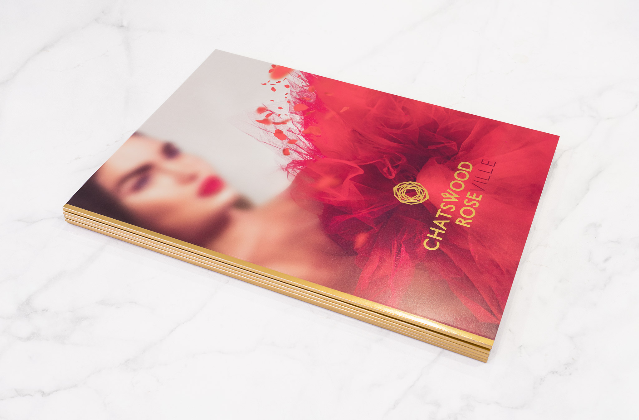
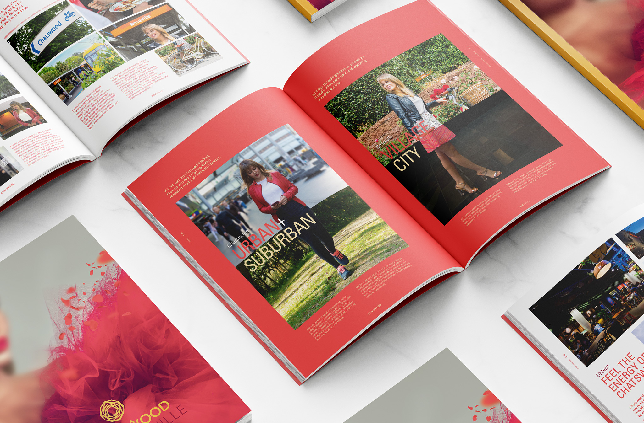
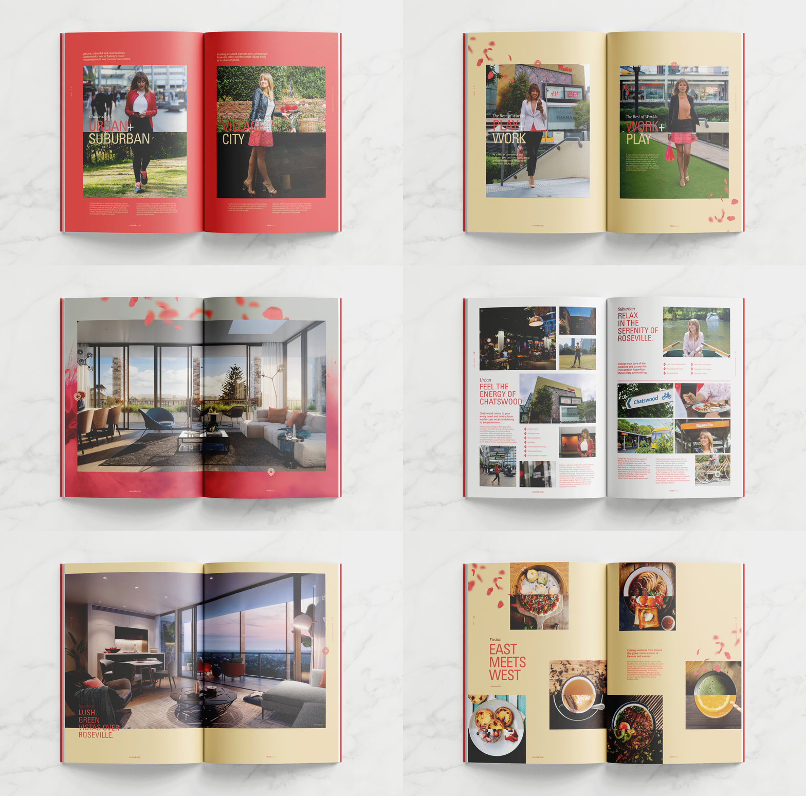
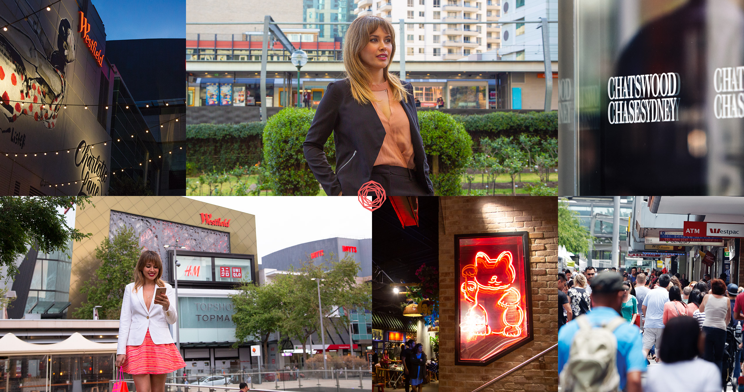
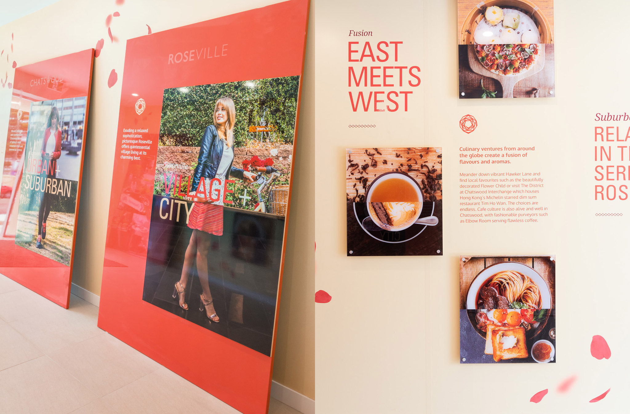
Identifying that the dual lifestyle was such a key for the development, my concept for the lifestyle photography for the campaign was to showcase the best aspects of both suburbs in an immersive cohesive way.
I photographed the lifestyle shoot, and for the hero images for the campaign, the model was positioned in key local areas. Utilising the split-screen image technique, created instantly recognisable imagery and reinforced the duality of the brand name and project positioning.
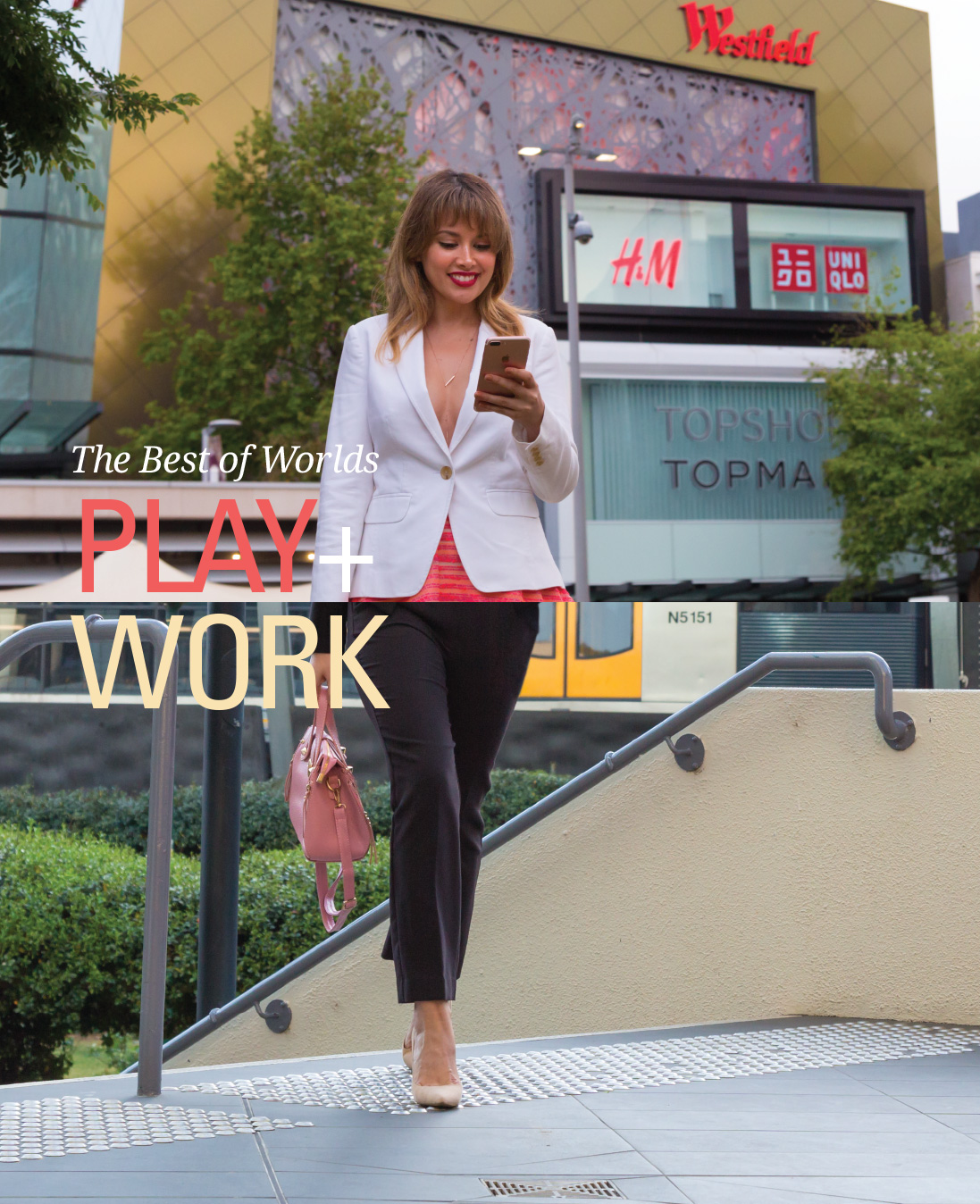
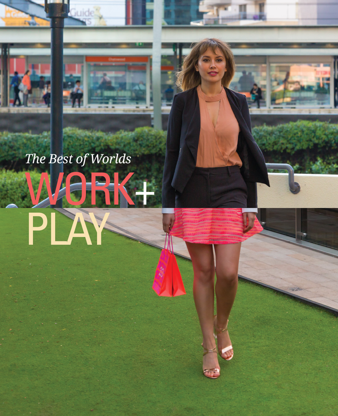
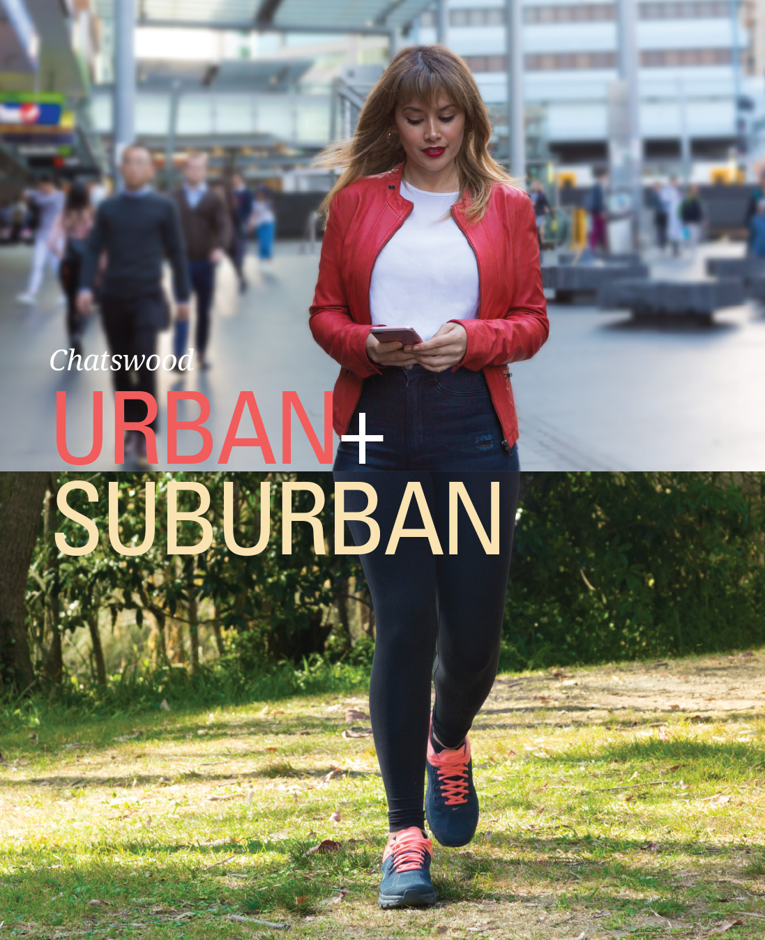
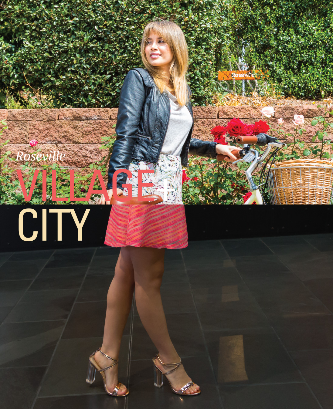

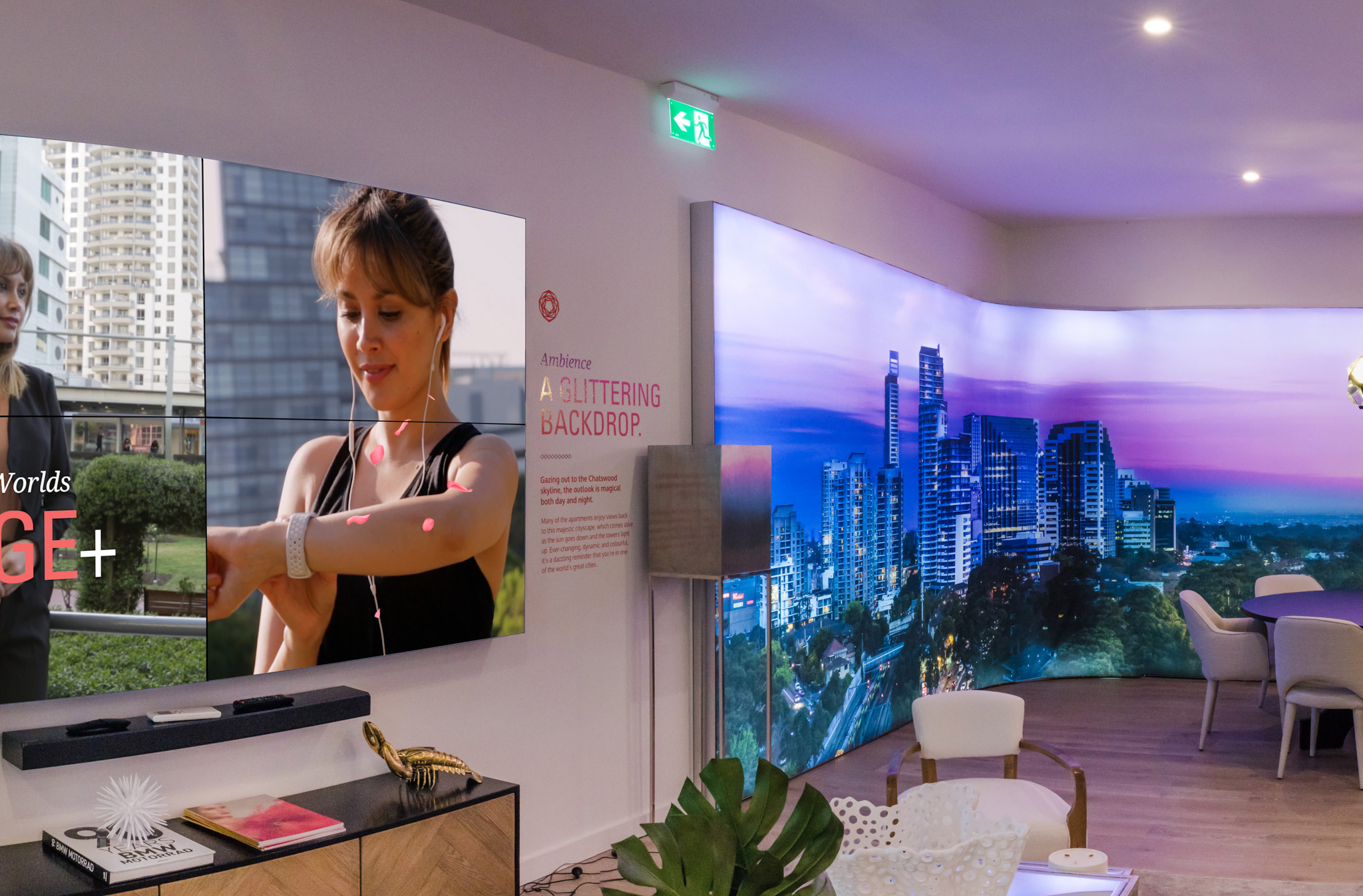
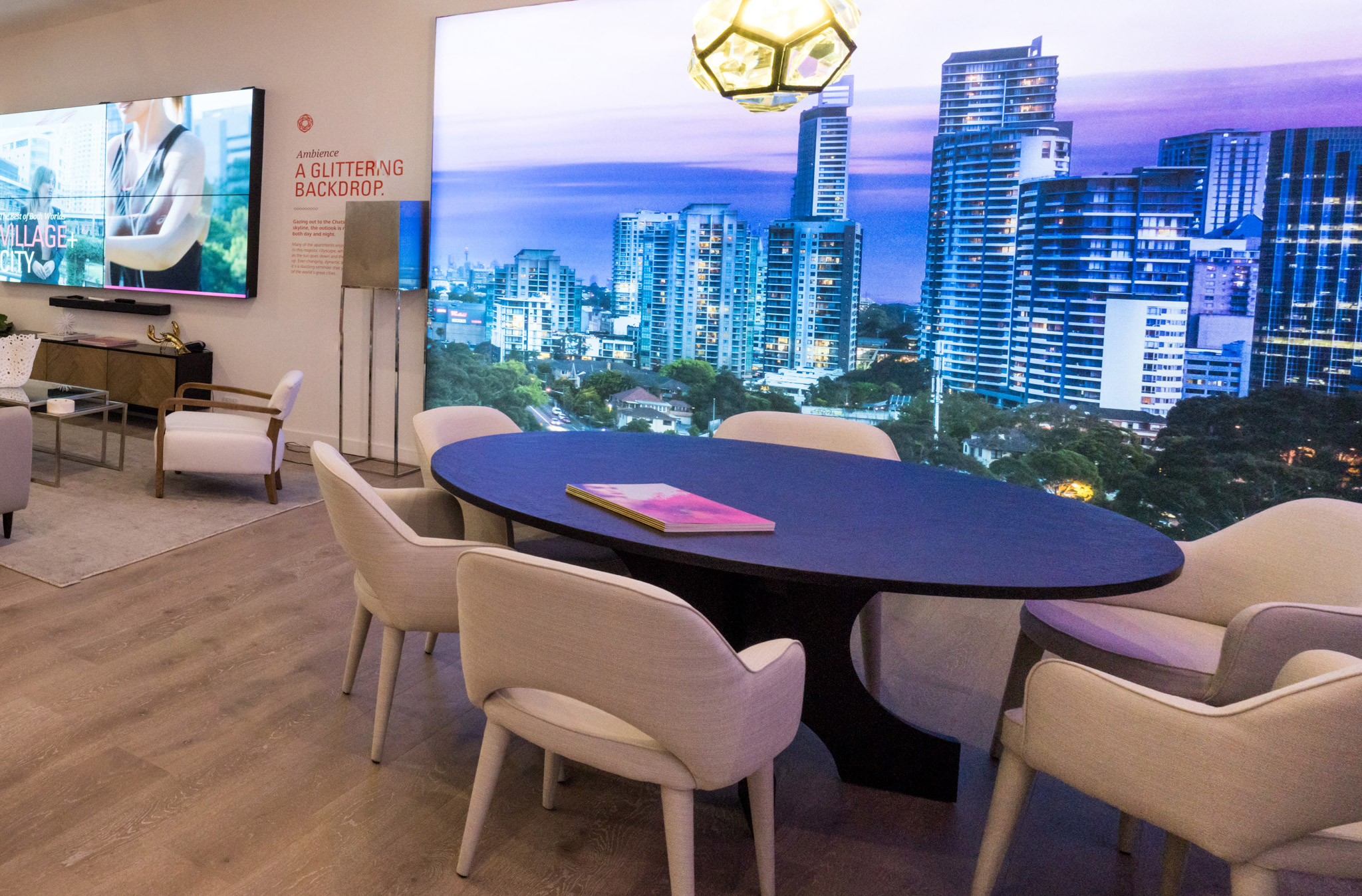
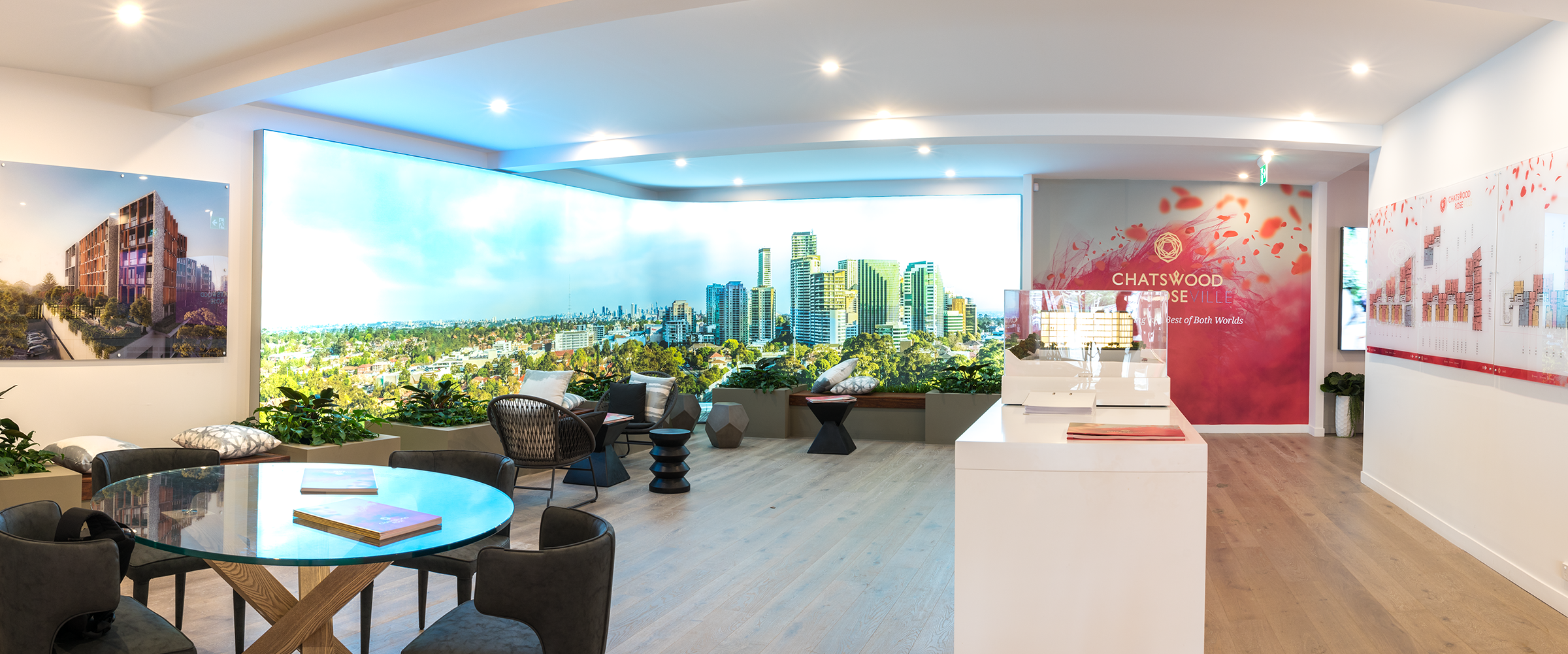
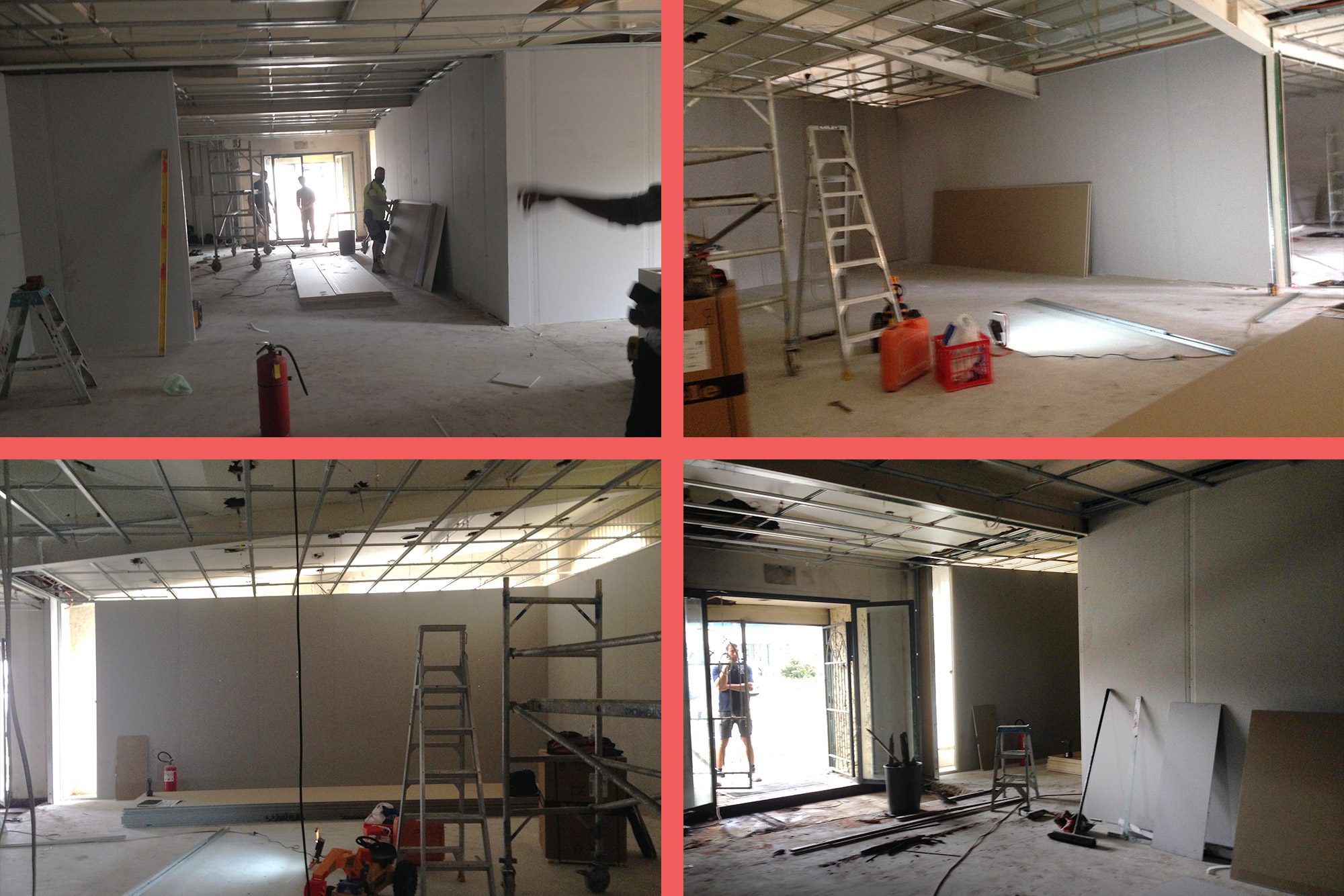
The concept and visual language of the best of both worlds carried on through to the purpose-built customised displayed suite. Starting out as a large empty dark retail space, my idea was to separate the large space into 2 distinct zones taking the purchaser on a journey from day to through to night.
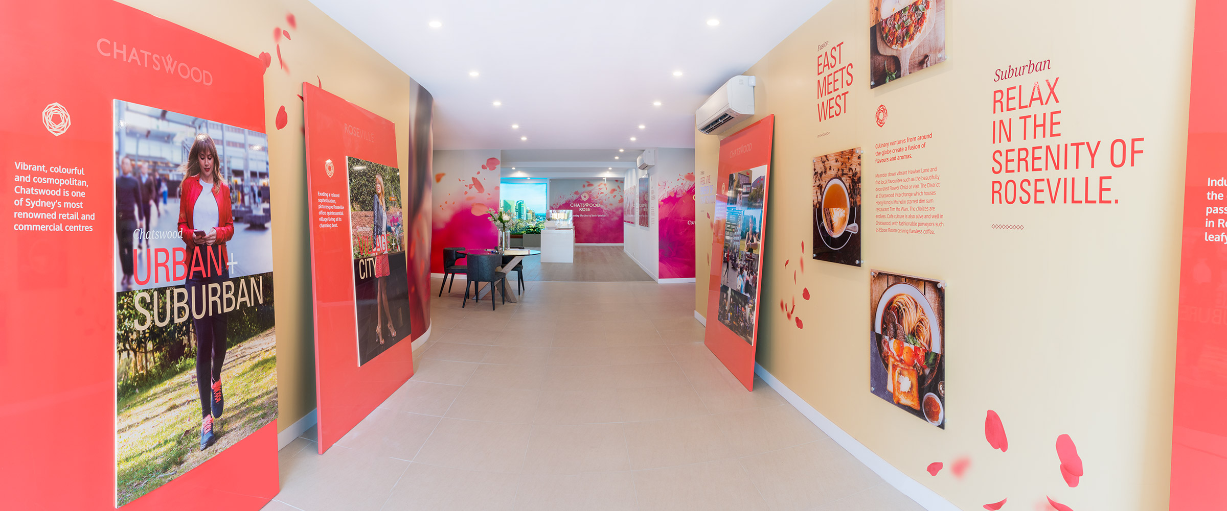
The purchaser would enter through a hallway with the beautifully crafted lifestyle boards and curved wall designed to give the customer an introduction and experience of what the area has to offer lifestyle-wise.
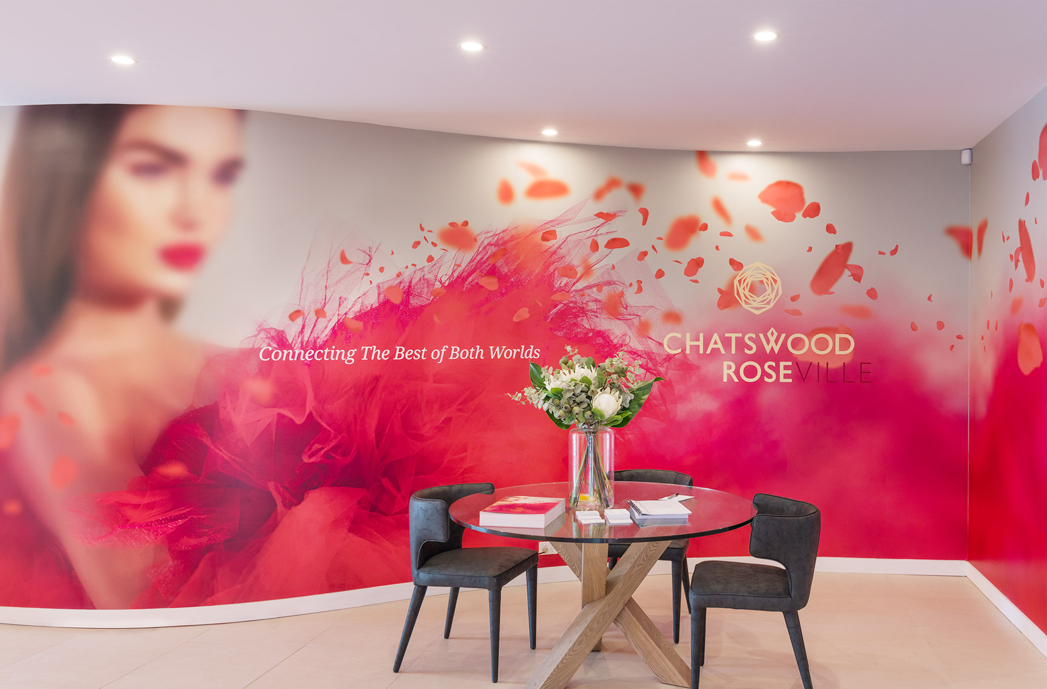
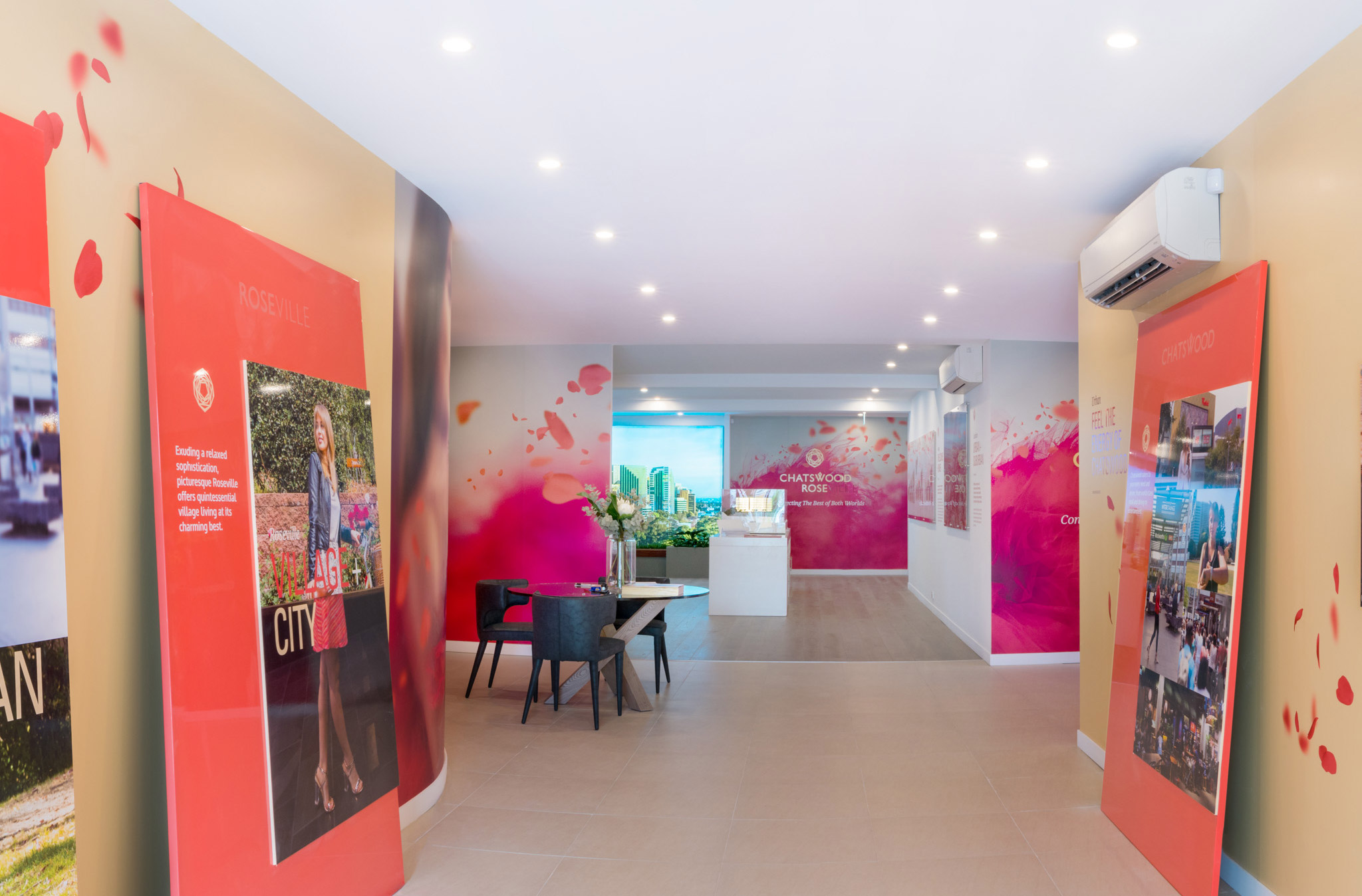
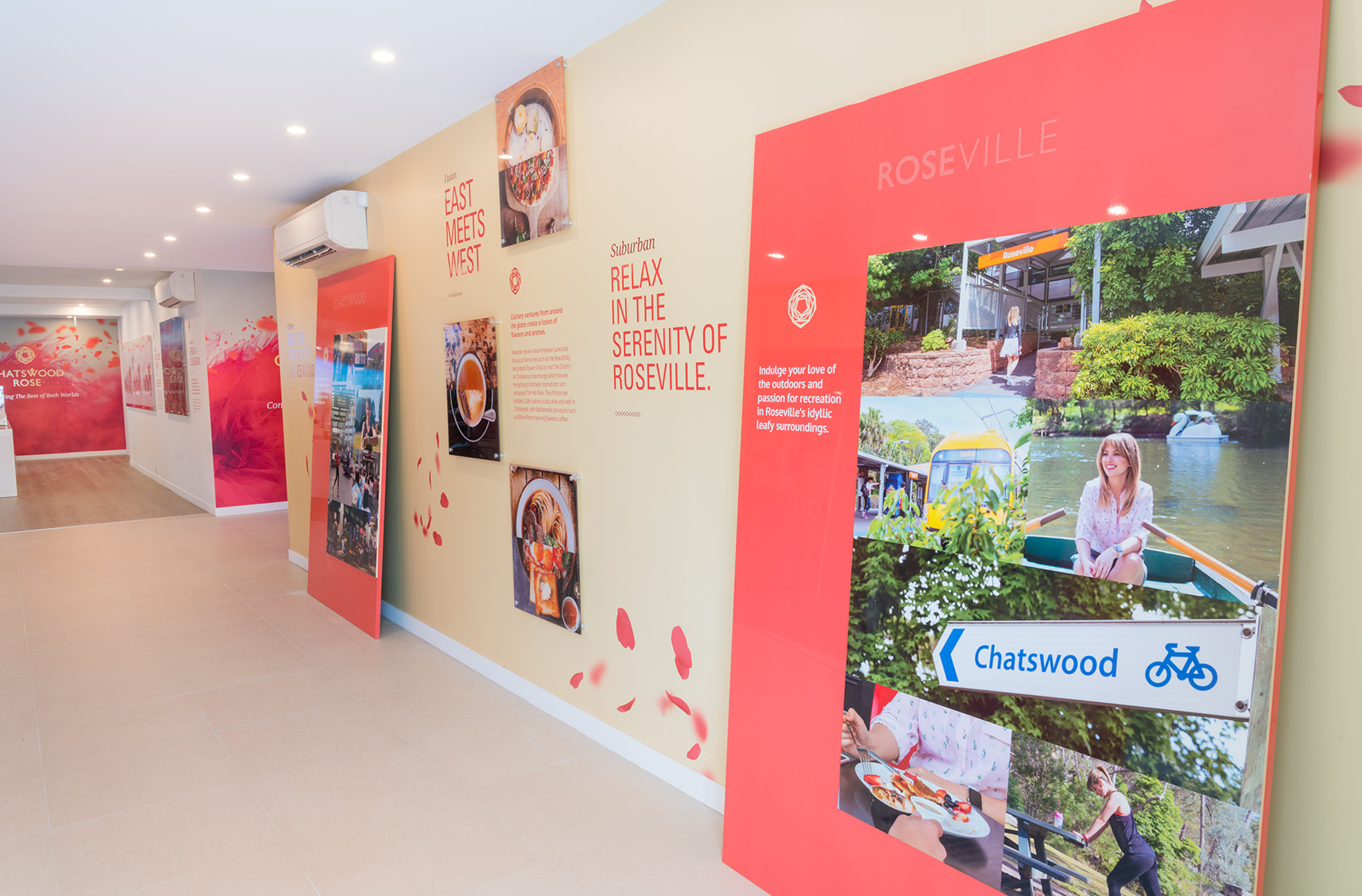
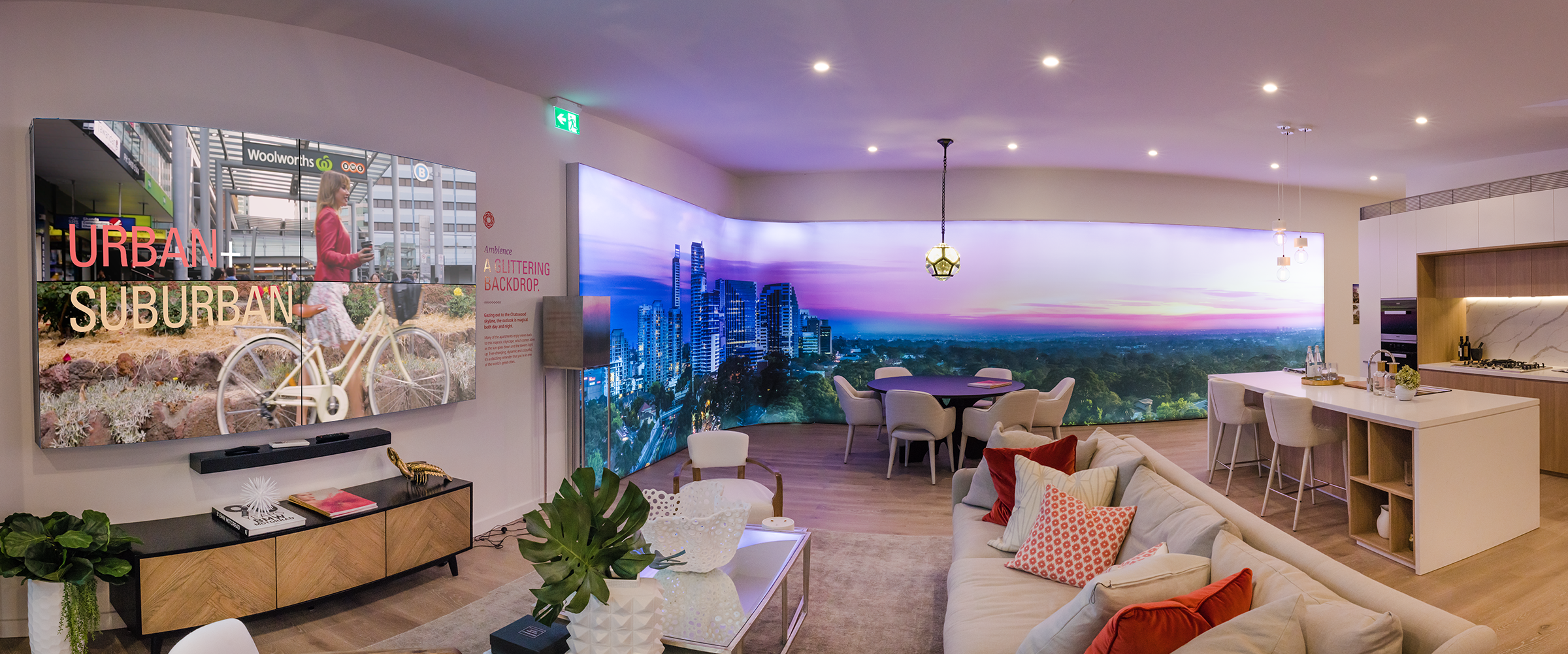
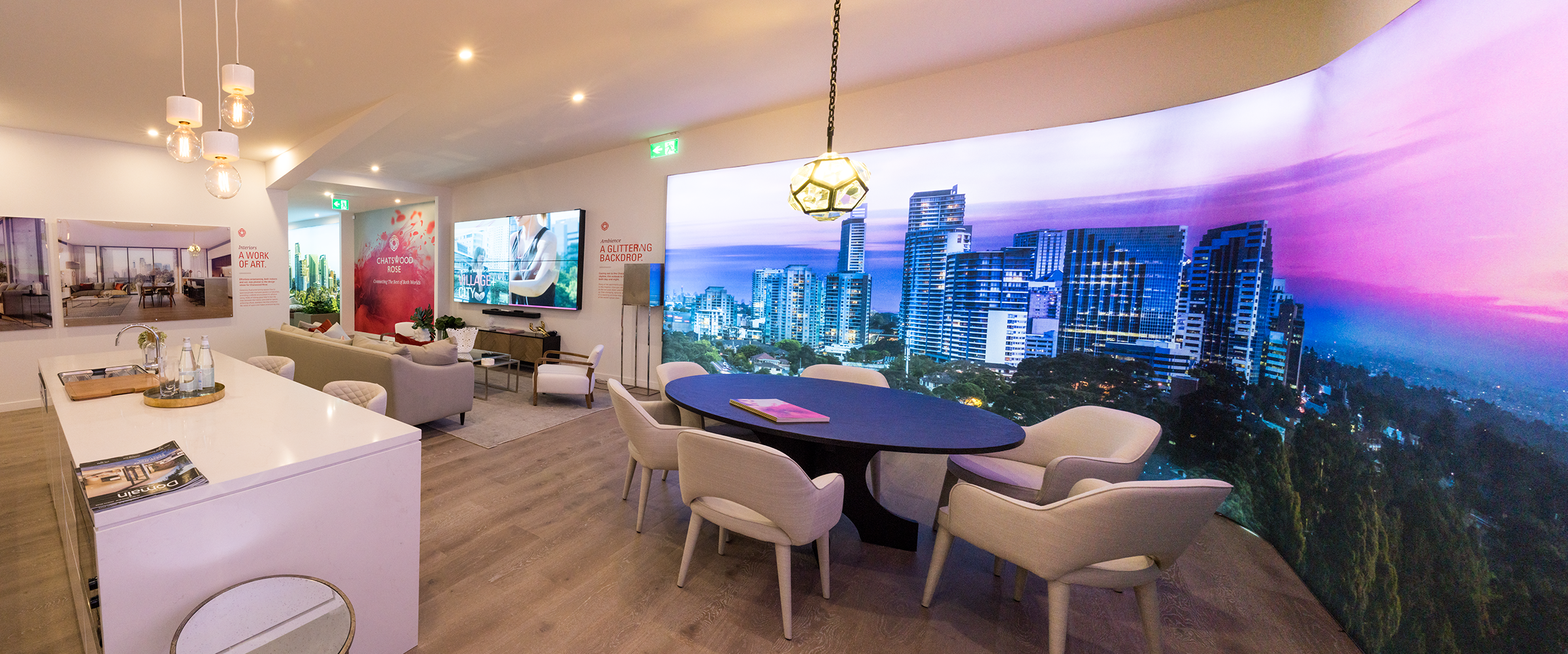
The journey would then lead the visitor to view the immersive floor to ceiling curved lightbox of the communal rooftop garden in the 1st room, then experience the rooftop view at night in the second room.
This immersive room would also showcase the project video and the materiality of the kitchen and bathroom and serve as the ultimate touch and feel experience of the product finishes.
